Having Fun With Games
Feb 19, 2025
Tags: hugo blog development css
Back in the groove
I’ve been struggling with the site a little bit. I made this games section and there was a lot that I left hanging to just start to use the thing. I had sort of written about this before with the “Work it” post, and I had hope that writing was going to get me through it but my issues remained. The games section was up and running but it didn’t look great, especially on mobile. The date thing was flying around the smaller the screen got, the conceptual fake-twitter cards didn’t look great and the idea that these were posts written at different times really felt like it was getting lost. But I was using it, I logged a few games and I liked having a place where I could my games writing, no matter the quality or importance. After all, this is basically for me. It’s also for you, if you like it, and if you don’t it’s bean soup and you can leave.
A few days ago I finally started to take a look at the RSS feed Hugo is generating. I loaded it into NetNewsWire and sure enough, it worked! But it was sort of a mess. The default Hugo RSS built-in template is set to just output the summary as opposed to the whole content. That was an easy change, but as I started to get into this I realized that the way I was building some parts of this site are a minefield for RSS. The bleets section needs a complete overhaul, I’m not really using titles or front matter! Its just a date and some shitposts! Images are also just completely broken which brings me to my Hugo hiatus, it was brief but I had to walk away nonetheless. Reading about render hooks and all the struggles much more competent people have with getting images into Hugo were enough to send me over the edge. Then I realized that I’m basically using 2 plug-ins to display images which are all pulling them in differently and would more than likely all require some bespoke solutions to get working. So I did what any intrepid hacker would do, I closed it all down and quit! I said “fuck this” and played God of War: Ragnarok for a week straight.
I absolutely will figure out that out at some point but now is not the time. What it was time for was implementing a few new features and a bunch of fixes in games. So! What’s new??
Collapsible menu!
The thing that I’m really proud of is the collapsible menu. The problem was due to the layout of the games sections, on mobile that ordered list of articles and titles was right at the top. So if you were to click on any of this, it would load and you’d never know it.
What to do?
I wanted to make that big list go away, but I didn’t want to use Javascript! So I turned to using a CSS trick which lets you use a checkbox to targe a neighboring <div> and using that on/off state with CSS selectors change things on the page.
.collapse {
}

.gamesmenu {
    max-height: 80px;
    position: relative;
    box-shadow: none;
    padding: 0;
    margin: 0;
}

.menucard {
}

.menucard label {
    text-align: center;
    font-family: 'Doto';
    color: #d62136;
    text-shadow: 2px 2px black;
    font-size: 40px;
    display: block;
    cursor: pointer;
}

/* Toggle Effect */

input#menu {
    display: none;
}

input:checked ~ .collapse {
    display: none;
}
The hardest part of this was getting it styled correctly and the real trick, and I hope this can help some weary-eyed amateur designer out there, the real trick is that your checkbox html cannot live in a closed div before the div you hope to change.
<div class="gameleftcolumn">
	<input type="checkbox" id="menu">

	<div class="sidecard">
		<label for="menu">Menu</label>
	</div>

	<div class="sidecard collapse">
		{{- partial "yeargames.html" . -}}
	</div>

	<div class="sidecard collapse">
		{{- partial "gamearticles.html" . -}}
	</div>

	<div class="sidecard collapse">
		{{- partial "gametags.html" . -}}
	</div>
</div>
It took me longer than I want to admit to learn that <input type="checkbox" id="menu"> could not live within the closed <div class="sidecard"> element if I wanted it to affect the neighboring sidecard/collapse element. I don’t know the science behind why, but just know that it doesn’t like it. I finally added a little bit of fun style by animating a plus sign that rotates when you click that menu, again all done with CSS. It’s an effective method that I think enchances the sites usability quite a bit.
EDIT: I forgot to mention there are plenty of tutorials out there that talk about how to do this but this is the one I found particularly helpful.
Bullets and icons!
While we’re talking about the lists, one thing that I had been thinking about doing since I started this section was to include some kind of bullet on the games list that would telegraph my progress on that particular game. I started to scour through discmaster for a cool bullet and eventually I found one I liked, a little glowing orb that was small. The list that this used to be was turned into a 3 column table. Hugo reads through the front-matter of game posts, I can set a param, progress, if its complete then it chooses a green orb. If it is set to inprogress it chooses the yellow orb.
It’s here where you go “Okay, cool, orbs and choices and progress, that’s fine, You build a table? For a list??” and to that I say “fuck yeah.” If it were just the bullet I’d have used the custom bullet as a background-image (which is what I’m doing in the table anyway) but since I am also setting this up to display a little icon to the right of the line, after too much css fiddling with positions and floats and whatnot, I decided to just build a table. and it works. And it’s responsive and looks great.
This works exactly the same as the orbs, parameters in front matter for whatever console. As of now I’ve pilfered a handful of icons from all over the internet to serve this purpose for now because, even as great as these are, I don’t think they server the intended purpose. They could be better. Readability is paramount for me, otherwise what’s the damn point of them? I also want them to have some degree of uniformity. I’ve opened affinity to poke around at this but I don’t know what they look like… yet.
What’s Changed?
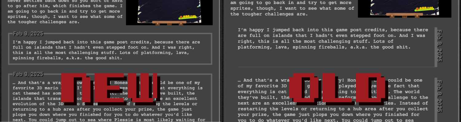
The vertical date used on the games specific thread pages is gone. I’ve changed over to a new style using the <fieldset> and <legend>. This was one of those compromises that I’m very happy with. Originally I was so proud of myself that I got this cool vertical date in the gutter of a box shadow, but it was impossible (for me, anway) to get right on mobile. So I compromised, and ended up with a look and function that I’m happier with. There are some examples of using <fieldset> to place rotated text around a box, but they were for very specific fixed sizes. As my CSS skills improve maybe I’ll come back to this.
In Conclusion…
I sit here thinking about how to punctuate this rambling diatribe about fumbling my way through CSS with the very gracious aid and ear of my Grand Vizier of HTML Rappy and I realize, I don’t really need one. I certainly don’t have one, I don’t have a point about all this except that I was excited for a victory, a small achievement that has boosted my confidence to get back into that code and continue to make this damn thing as usable as possible. Even though life outside of the internet continues to spiral out of control, I think its important to reach for the small things we can control. Even the most viscious rodeo bull has steady hands on the reins, even if its just for a brief moment.


