Buff Certification
May 6, 2025
Tags: development blog games graphicdesign
Welcome to May!
April went by like a dragonfly out of the corner of my eye. Lots of family stuff, lots of work, all of which is good because my life has been lacking both, this year. I glanced at my blog and realized the last thing I published there was my not-review on Travels with Charley, a book I very much enjoyed. I have started a third book, Even Cowgirls Get the Blues but I’ve taken a break - Catrena is going to get the audio book, and I’ve been catching up on some comics. It’s not exactly non-fiction but I’ve had that book on my shelf for years (yes, I had started it in the past and yes, I am already past where I was back then).
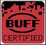
I’ve also come back to the blog because of a new feature I’ve added to the games section, Buff Certification. This is a silly label I’m adding to games that I feel are the perfect embodiments of the games I love. They are not going to be the best games ever made, they might have rough edges, they may even be controversial, but they are games that fit within me, click perfectly into my personality, have influence over my thoughts. We all have those tastes, I think as I get older I’m getting better at recognizing mine. When we’re younger (when I was younger) we have more to prove - some of us anyways - we hold up pretentions so that people will think about us one way or another, we may not want to admit that the pop-corn flick made for mass consumption is actually wonderful and we love it. The older you get, the less you care about other peoples’ opinions - well for me anyways. So as a fun exercise I decided I wanted to add this classification to the games section, and in order to do that I need a catchy graphic.
Where to Start?
Right away I knew I wanted this to be some kind of certification. I almost called it CERTIFIED DANK… but decided against it for obvious reasons. BUFF CERTIFIED was actually the second name I came up with and it just stuck. It’s great! Weird, short, concise - love it. I wanted the graphic to feel like a digital version of a USDA meat grade, you know like GRADE A BEEF, because people eat buffalo, get it? What is the cyber version of that? I started to do some picture research and the only thing I came up with was this GOG Preserved Game logo. It’s the only example of a cyber brand I saw that I thought was at all interesting. I played around with it for a little while - and didn’t get very far because it just felt a) derivitive and b) not very interesting - I didn’t even add any color to it before I abandoned the idea.
The next avenue I took was to just play with fonts and color. If I could come up with a combination I liked maybe the idea of the logo would come. When making one of the default blog images I found this cool pixelated gradient that felt very much in line with the rest of the direction of the graphics. I decided to use this as a background and then played with some fonts on top of that. I liked where this was going, but the aspect ratio felt off, and it wasn’t referential. I wanted it to be some kind of cyber brand, even though I didn’t know what that was.
Enter - Outside Influence
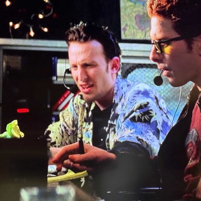
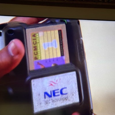
When I’m working at my desk I have a habit of watching movies at the same time. Fifty percent of the time my choice will provide the right amount of background noise that I will be able to concentrate and get through whatever task I have in front of me. The rest of the time is split, 25% of the time I shut the movie off because its distractingly bad and the final 25% I slowly move my way to the couch and get completely sucked in. It’s because of this habit that I stumbled onto what would be the final design directive for this project, and it came from a Will Smith movie called “Enemy of the State”, an insane movie that features Jack Black, Seth Green, Jamie Kennedy and Jake Busey as an elite NSA hacking team that is chasing down Jason Lee who is also a hacker. Knowing that the pursuit is underway - he feels the heat! - the only thing left for him to do is use his floppy drive to copy a video to PCMCIA card and then store that card in the back of an NEC TurboExpress (I know I know).
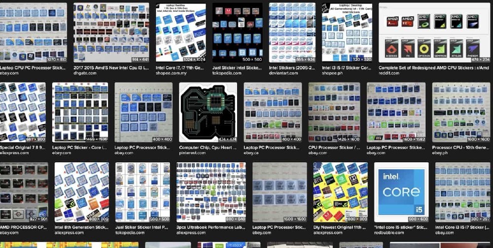
Why am I telling you this? Well, as Jake Busey attempted to bust into the apartment they quickly panned around the room which was well decorated, lots of cool 90s tech, and there on the front of one of one of the computer towers, shining like a beacon of hope and inspiration, was a processor badge! Or at least I thought it was, i went back and couldn’t find it again, maybe I was just reminded that they exist but A PROCESSOR BADGE! The little stickers that go on the front of your beige tower that tells the entire world you assuredly have a pentium processor inside!! If there were ever a cyber-brand for digital cowboys THIS! WAS! IT! Glance upon the glory, take them in and be reminded!
What’s Inside?
Looking closer through all of these, one of them stood out as something that I could gain inspiration from. It wasn’t necessarily my favorite -the 286 badges are particularly well crafted, though I cannot verify their authenticity - but a simple, modern looking Pentium sticker was the one. It was simple and just glancing upon it I could easily translate it into my own design language, using the pixelated background and the fonts I liked. The actual design came together pretty fast, I just needed to tweak the colors, apply the fonts and then… the circle… what am I going to do for the circle? The Intel branding has had that perfect little swooshing circle around it for decades, but that’s not what I wanted, that’s not the cyber buffalo way!
I went through a few iterations of this, the first was a non-pixelated circle that I bisected with the word BUFF and I left it at that for about 24 hours. I kept thinking about it, how it didn’t fit in. It looked too … normal. I continued to play around with circles and then I looked through some stock graphics I had downloaded, looking for something pixelated that could spark inspo. I found a sheet of graphics that were circles and arrows, all done with square pixels. None of the circles worked, so I copied one of the partials, made it whole, applied it to the graphic and started to chip away at the squares. I tweaked this so it wasn’t even and had more of that swoosh effect. Some time with this and I was finally happy. Introducing you to the BUFF CERTIFIED badge. It’s going to make a great sticker.
Thanks for walking back through that process with me. It was fun to come up with. This was all because I wanted to say The Bouncer was sick as hell and worth more than a sarcastic youtube video. It’s a way for me to say “Take another glance at this game, it has something going for it you aren’t going to find somewhere else, at least not exactly.” You can even browse through all the games with this classification thanks to the Hugo taxonomy series.
Attributions
Red and Black Pixelated Gradient
